
The Stand Rebranding
Design Concept: The Celebration of Life
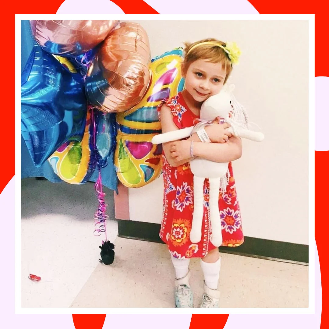
The Stand is a non-profit organization, in connection with Children’s Miracle Network, that raises money for Cohen’s Children’s Hospital. Every year the organization hosts a series of events to fundraise, ending in an annual dance marathon in May.
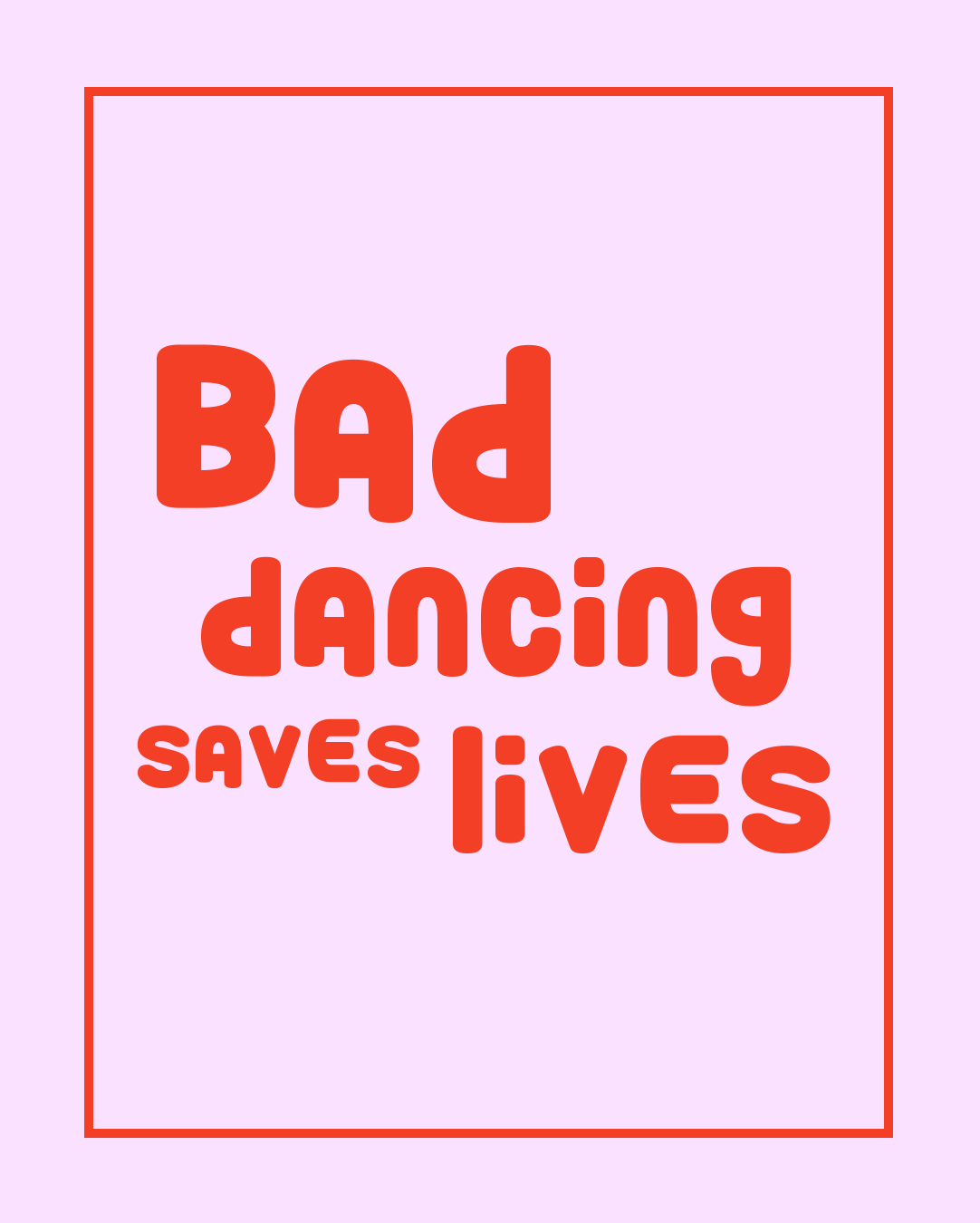
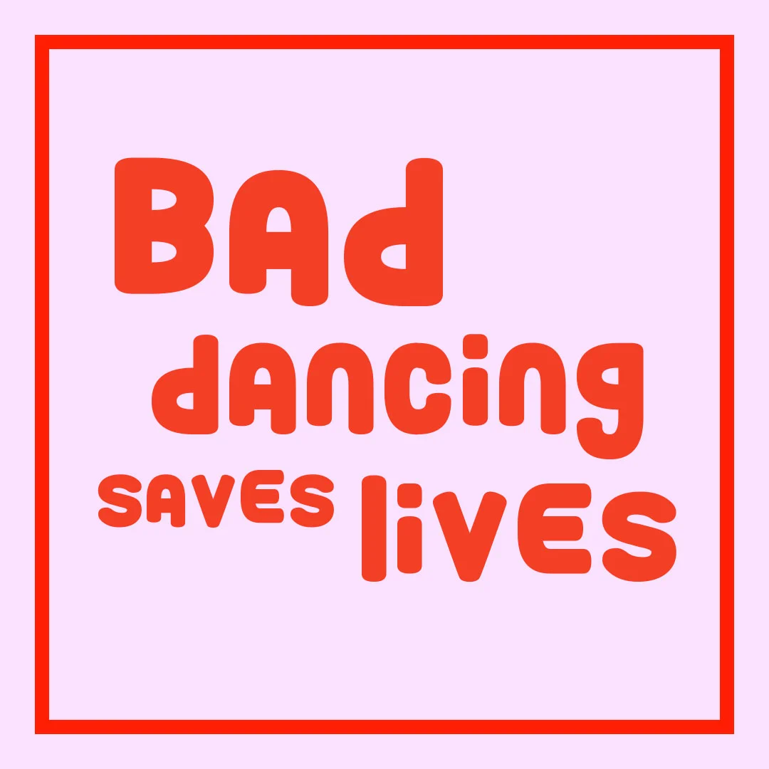
This design concept focuses around the optimistic outlook of the organization. The dance marathon is atypical of other non-profit events because of its cheerful and positive nature. I incorporated movement in the logo and design to mirror our dancing and the constant motion of our fundraising efforts. With playful elements and kid-like typography, we are able to attach ourselves to the root of what we believe in and encourage individuals to stand up and dance for those who can’t.
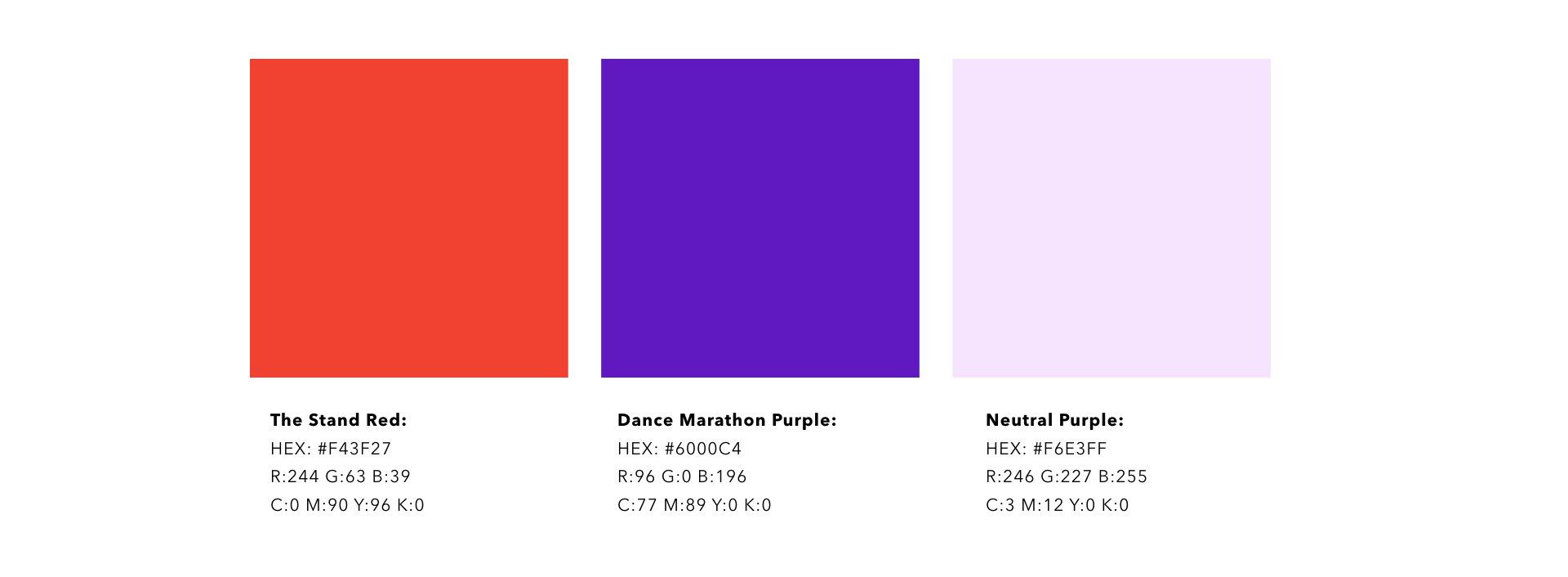
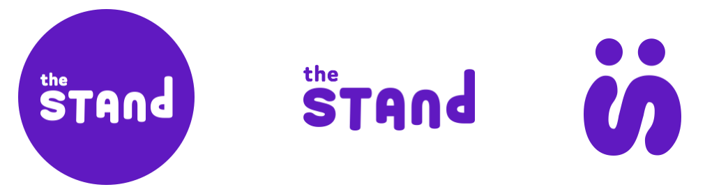
BRAND GUIDELINES AND LOGO DESIGN

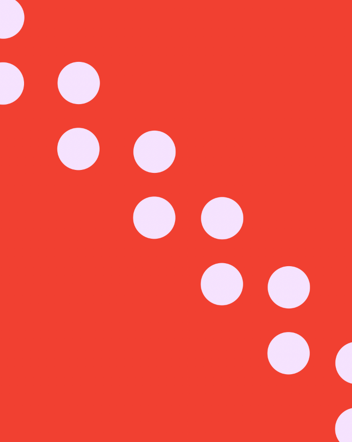
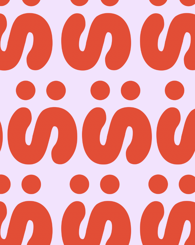
PATTERN DESIGN


GRID DESIGN


WEBSITE REDESIGN

